Stock Analysis with Python: Modeling Prices, Returns & Distributions
Learn how to analyze stock market data using Python. This guide covers calculating daily returns, visualizing volatility, and modeling statistical distributions with yfinance.
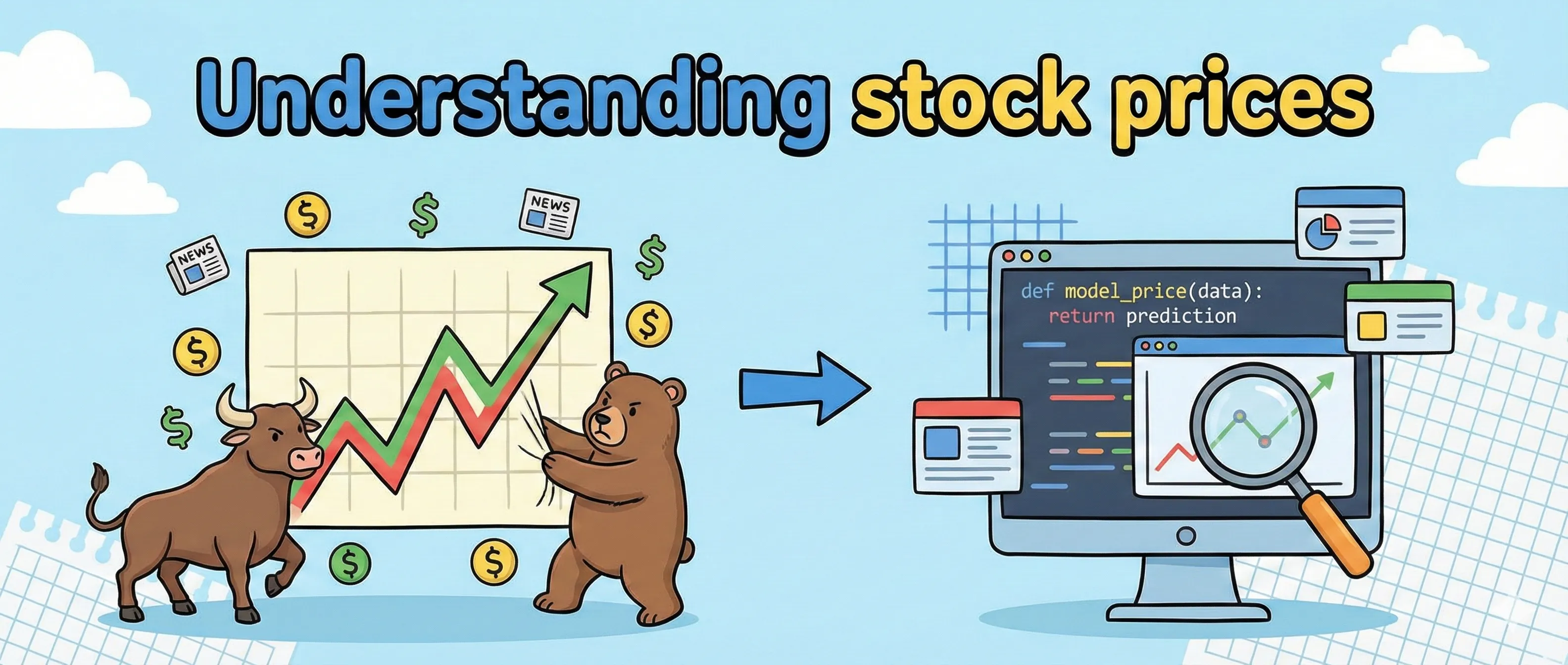
In previous posts in this series, we have looked at loans, bonds, and other financial securities built around these products. Many of the securities we have not discussed yet depend on stock pricing. To understand the behavior of different investment strategies, we will discuss it is crucial that we understand how stock pricing works.
Before we can understand how pricing works, we need to know that a stock represents fractional ownership in a company, with limited liability. The value of a stock can be estimated by combining a traditional balance sheet analysis with day-to-day fluctuations in response to market buy and sell pressures.
Modeling and analyzing real stock data
To better understand what a stock is and how it behaves, we will model and analyze the price of a real stock. Let’s analyse Apple’s historical data.Inc. For our analysis, we will use daily data from the last 5 years, including Open, Close, Low, Volume, and Adjusted Close for each day. The difference between the Close and Adjusted Close value is that the Adjusted Close incorporates the effect of dividends on the value of the stock. For our analysis, we will focus on the Adjusted Close. First lets plot all our data points. If you want to know how to do that, have a look at the post “Data science with Python”.
import yfinance as yf
import matplotlib.pyplot as plt
import pandas as pd

# 'Adj Close' is preferred as it accounts for dividends and stock splits
aapl_data = yf.download('AAPL', period='5y')
df = aapl_data[['Adj Close']].copy()

# Plot the Price History
plt.figure(figsize=(12, 6))
plt.plot(df.index, df['Adj Close'], label='AAPL Adjusted Close', color='blue')
plt.title('Apple (AAPL) Stock Price - Last 5 Years')
plt.xlabel('Date')
plt.ylabel('Price (USD)')
plt.grid(True, linestyle='--', alpha=0.5)
plt.legend()
plt.show()Based on this plot, you probably think that the trade price looks pretty random, so how will we model this? To get a useful model its a good idea to look at the stock returns instead of the actual stock prices. The rationale is that the most important thing to an investor is the return on their investment. For example, a €10 stock changing €1 is very different than a €1000 stock changing €10. We can calculate the daily stock return using the formula:
Where:
- = is the return at time
- = is the price at time
- = is the price of the previous day
When we apply this formula to our Apple data and plot the results, the graph changes drastically. Instead of a line that wanders upwards over time, we see a graph that oscillates around zero.
import yfinance as yf
import matplotlib.pyplot as plt
import pandas as pd

# pct_change() calculates (Price_t - Price_t-1) / Price_t-1
aapl_data = yf.download('AAPL', period='5y')
df['Daily Return'] = df['Adj Close'].pct_change()

# Drop the first row (NaN) created by the calculation
df.dropna(inplace=True)

# 4. Plot Daily Returns (Volatility)
plt.figure(figsize=(12, 6))
plt.plot(df.index, df['Daily Return'], label='Daily Returns', color='orange', linewidth=0.7)
plt.axhline(0, color='black', linewidth=0.5) # Add a line at 0 for reference
plt.title('Apple (AAPL) Daily Stock Returns')
plt.xlabel('Date')
plt.ylabel('Return') # e.g., 0.02 means 2%
plt.grid(True, linestyle='--', alpha=0.5)
plt.legend()
plt.show()
This transformation is critical for modeling because it makes the data stationary. Or in simple terms, while the price of Apple can go anywhere, the daily return usually stays within a predictable range. Looking at the Apple data, we can observe two key characteristics.
- Clustering: Notice how the spikes tend to bunch together? This tells us that if Apple stock is volatile today, it is likely to be volatile tomorrow.
- The range: For a stable giant like Apple, the vast majority of daily moves fall between -2% and +2%.
To model the probability of making or losing money, we can use these daily return values to create a histogram. This histogram reveals the stock’s “personality.”
import numpy as np
import scipy.stats as stats
import yfinance as yf
import matplotlib.pyplot as plt
import pandas as pd

aapl_data = yf.download('AAPL', period='5y')
df['Daily Return'] = df['Adj Close'].pct_change()

plt.figure(figsize=(10, 6))

# Plot the actual data histogram
# bins=50 breaks the data into 50 "buckets"
plt.hist(df['Daily Return'], bins=50, density=True, alpha=0.6, color='green', label='Actual Returns')

# Plot the Normal Distribution curve for comparison
mu, std = df['Daily Return'].mean(), df['Daily Return'].std()
x = np.linspace(df['Daily Return'].min(), df['Daily Return'].max(), 100)
p = stats.norm.pdf(x, mu, std)
plt.plot(x, p, 'k', linewidth=2, label='Normal Distribution')

plt.title('Distribution of Apple Daily Returns')
plt.xlabel('Daily Return')
plt.ylabel('Density')
plt.legend()
plt.grid(True, alpha=0.3)
plt.show()

# Optional: Print statistics
print(f"Mean Return: {mu:.4f}")
print(f"Standard Deviation (Volatility): {std:.4f}")For Apple, our analysis shows a curve that looks very similar to a Normal Distribution, but with a few distinct features.
- The Mean: The center of the curve is slightly to the right of zero. This reflects Apples log-term upward trend over the last 5 years.
- Fat Tails: Unlike a perfect mathematical bell curve, real stock data has “fat tails”. This means extreme events, like a 5% drop in a single day due to a missed earnings event, happen more often than a standard normal distribution would predict.
By understanding that Apple’s return follows this distribution curve, we can start calculating risk. We know that roughly 68% of the time, tomorrows return will fall within one standard deviation of the average. This statistical model serves as the basis for more advanced models, such as Monte Carlo simulations and Value at Risk.
⚠️ Financial Education Disclaimer
This post uses Apple Inc. (AAPL) historical data for educational and illustrative purposes only.
- Not an Endorsement: The mention of specific tickers or companies does not constitute a recommendation to buy, sell, or hold any security.
- Model Limitations: Stock market returns often exhibit “Fat Tails” (Kurtosis) and non-stationary behavior. The Normal Distribution model shown here is a simplifying tool and frequently underestimates the probability of extreme market events.
- Data Accuracy: While
yfinanceis a popular tool, data can contain errors or be delayed. Never base financial decisions solely on automated scripts.- Risk Warning: Trading stocks involves a high risk of losing capital. Only invest money you can afford to lose.